|
Contrast
This refers to difference, including the differences in values, colors, textures, shapes, and other elements. The major contrast in the piece should be located at the center of interest, which helps create the focal point. Too much contrast scattered throughout the work can destroy unity and make work more difficult to look at. The reason contrast is used is to create visual excitement by making the piece more interesting. Without this element, the work would be boring.
Types of Contrast & Examples
Pattern Contrast
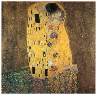
Pattern contrast happens when an intricate pattern is next to an object without a pattern. In the example below, "The Kiss", by Gustav Klimt, shows the difference between a rectangular and circular pattern next to the background without a pattern.
Edge Contrast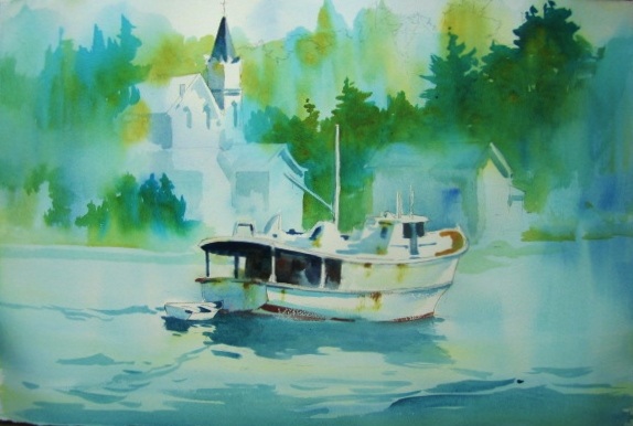
In this painting, the boat is clear and well defined, along with the point of the building behind it. However, the background and landscape seem blurry and have soft edges. The overall effect of these two elements is contrast so we can make a distinction between the separate features in the piece.
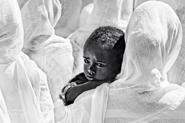
Value ContrastValue contrast is the placing of dark shades against lighter ones. The highest concentration of value is black, whereas the lowest is white. The more stark the variations between these shades is, the more intense the image will appear. In this image, there is a young boy with darker skin, being carried by a woman, surrounded by other women, wearing stark white cloths. This creates an intense contrast and draws the eye to the focal point; the little boy.
Intensity Contrast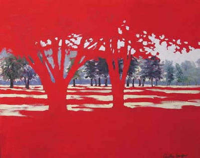
Intensity contrast happens when a pure intense color is next to a muted color. The pureness and intensity of the color seem to make it glow. In the artwork above the red trees radiate off the background of the muted blue, green, and white trees.
|
Temperature Contrast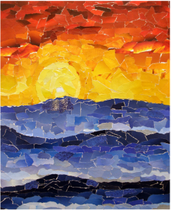
This shows the differences in colors. The warm orange and yellow colors are contrasting with the cold blue color. Neither the darkest orange color or red are directly next to the blue, which would prevent the image from being attractive. This makes it easy to see the two separate parts of the piece while also bringing attention.
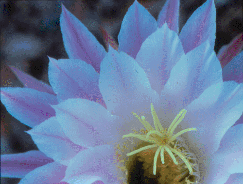
Textured ContrastTexture contrast is the feel of a surface or how something appears to feel. In the picture below, the petals of the flowers appear smooth, but the edges have a rough texture. In the middle part of the flower it appears to have a stringy texture on the outside of middle part and the light yellow that is off to top right. In the center of the middle part there is a dark yellow, fuzzy texture. Even the background has a smooth surface even though it is blurry.
Size Contrast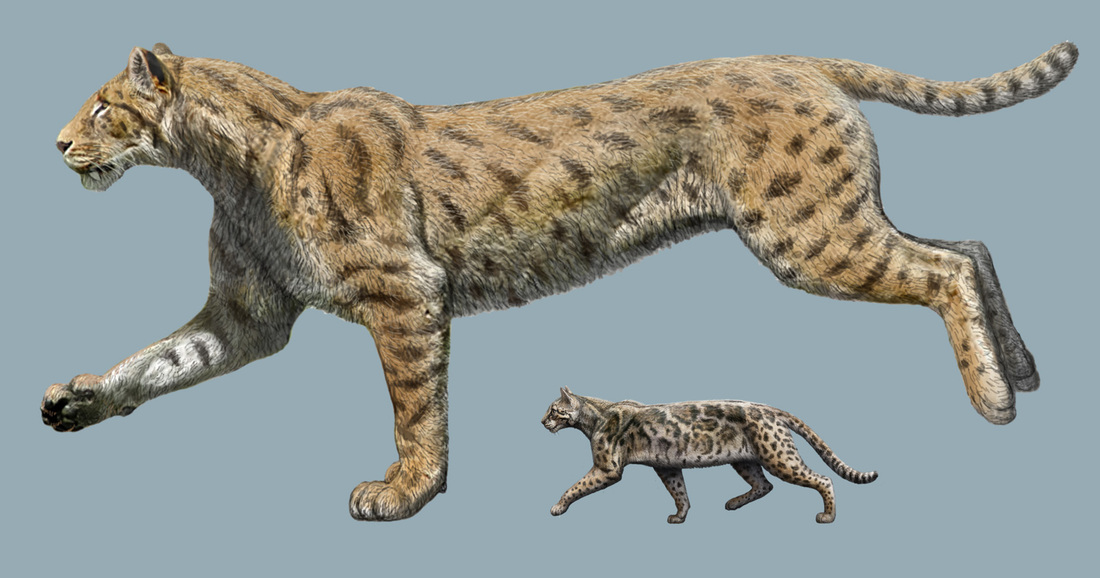
Size contrast shows the elements in a variety of sizes in an artwork. This difference in size adds visual interest and is used to show depth, variety and emphasis. In the picture above, you can clearly see the huge difference in size. The Sabertooth is far larger than the small housecat. The high size contrast also gives the illusion of the smaller subject being farther away.
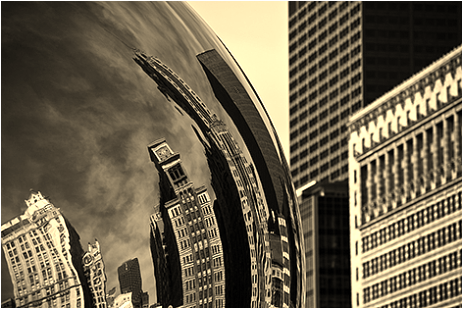
Shape Contrast Shape contrast is created by placing organic shapes alongside geometrical ones. As seen in this image, there are the sharp edged, geometrical shaped buildings adjacent to the more rounded shape of the Cloud Gate. Also, in the buildings' reflection, they are more rounded and warped looking, adding to the contrast of the shapes.
|
